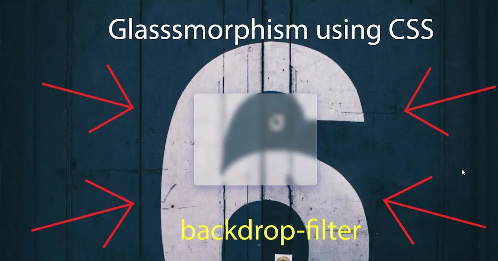


Glassmorphism is pretty simple to accomplish for front-end designers. There is one fundamental CSS property that we can use backdrop-filter: blur(); . This property permits you to apply various impacts, for example, obscure, sepia, and greyscale to the territory behind your part. Since it applies to everything behind the segment, to see the impact, you should make this component at any rate incompletely straightforward.
Here we have some CSS code to create glassmorphism element:
<div class="glass"></div>
.glass
        {
            height: 300px;
            width: 400px;
            position: fixed;
            top: 50%;
            left: 50%;
            transform: translate(-50%, -50%);
            background: rgba(255,255,255,0.25);
            box-shadow: 0px 8px 32px 0 rgba(31, 38, 135, 0.37);
            backdrop-filter: blur(8px);
            border-radius: 10px;
            border: 1px solid rgba(255, 255, 255, 0.18);
        }
Let's go through one more tutorial: